I attached the mobile version picture on here, the buttons for monthly and annual subscription are side by side so it makes it confusing. The desktop version looks great can the mobile version mirror that.

I attached the mobile version picture on here, the buttons for monthly and annual subscription are side by side so it makes it confusing. The desktop version looks great can the mobile version mirror that.
I have implemented it in the latest (3.4.5) version, and have updated your site.
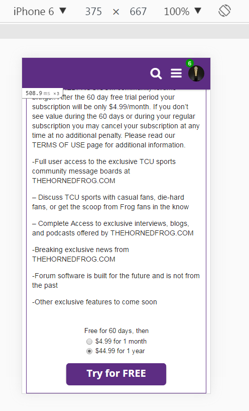
Dmitry, I am still showing the same setup along multiple devices where it is not clear what subscription you are selecting. Can this sometimes take a little bit to load? I am using an iPhone, if that matters.

I have fixed it now.

Works great!! 